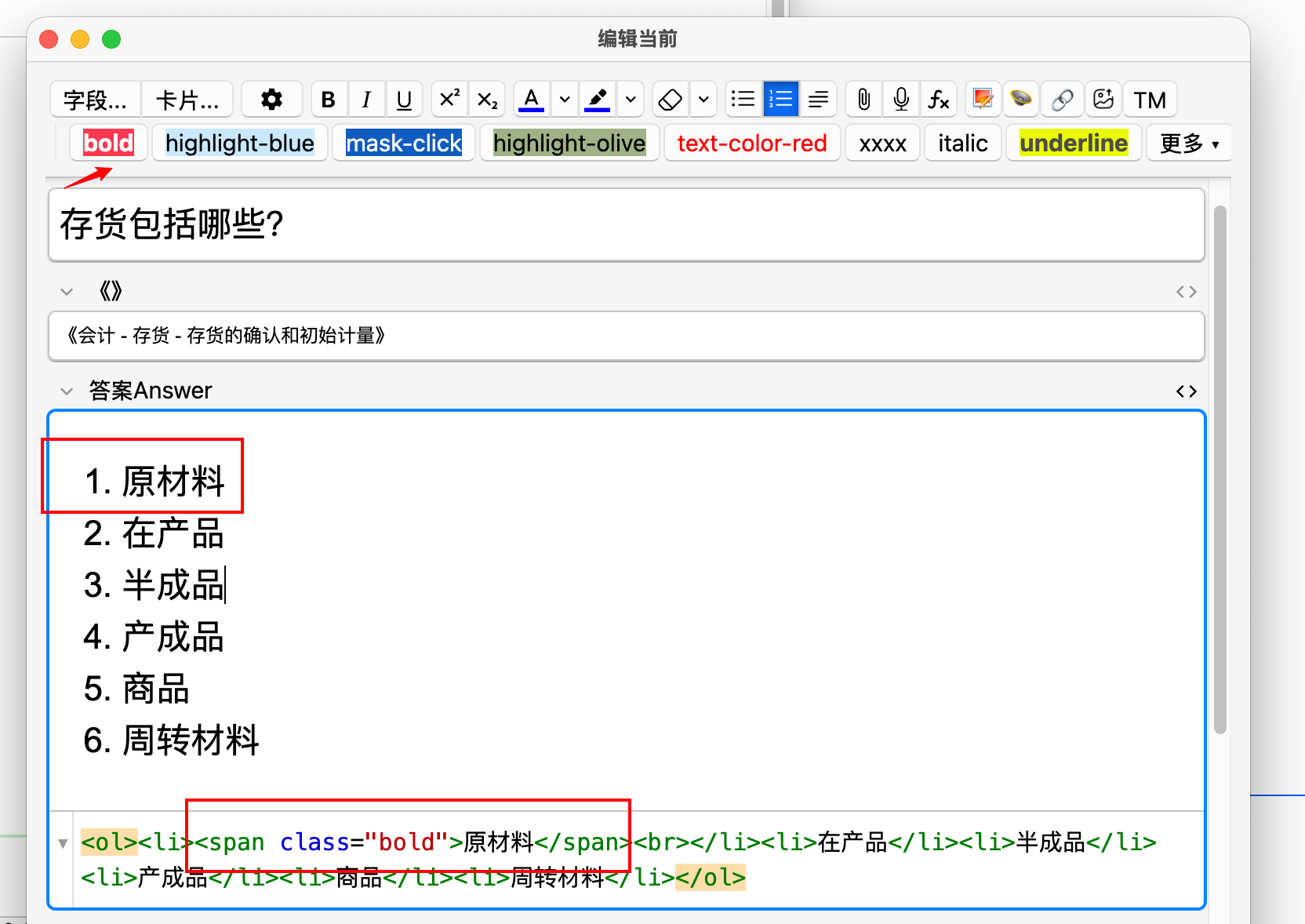
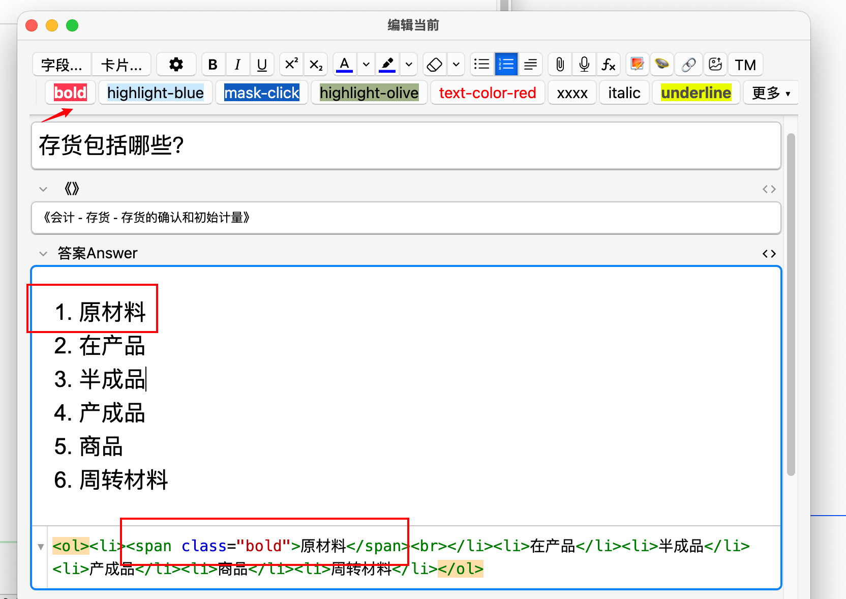
你是否在卡片模板的 Styling 里定义了一堆好看的 CSS class,却总要手写 <span class="...">...</span> 才能用上?
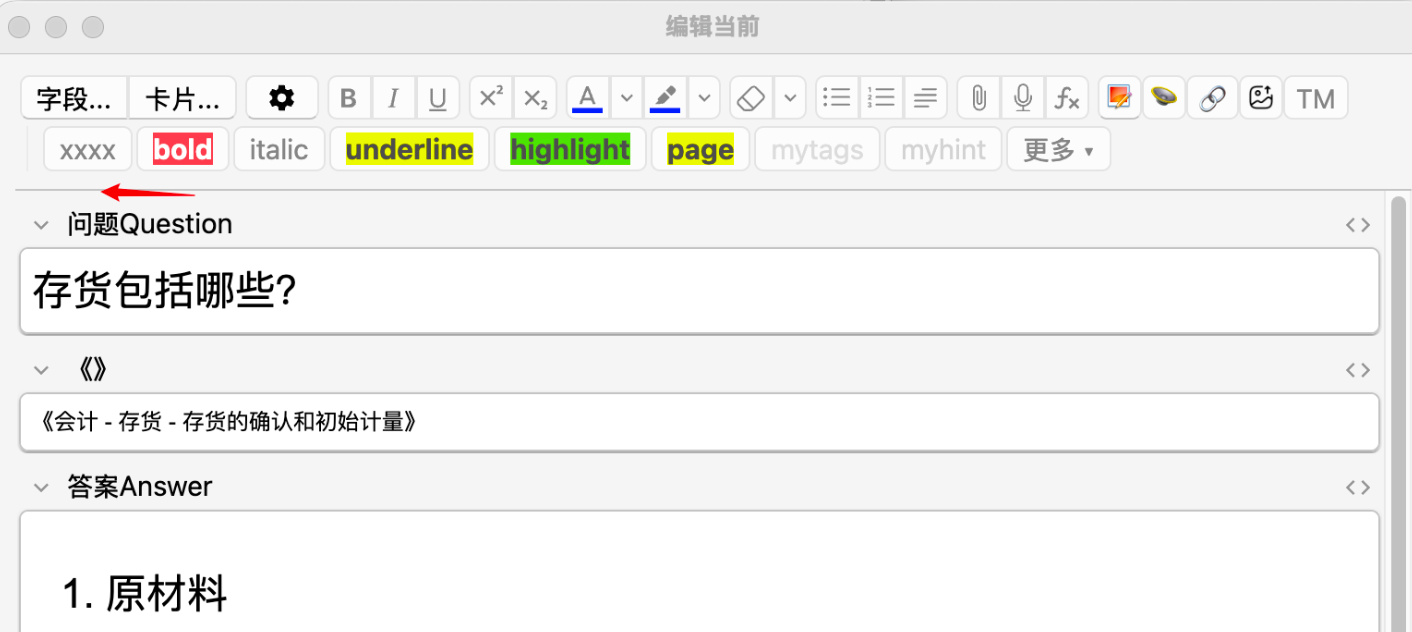
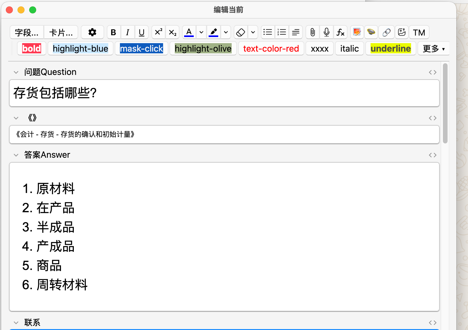
这个插件会自动解析当前笔记类型的 CSS,把其中的自定义 class 变成编辑器工具栏上的一键按钮:
选中文字 → 点一下 → 自动包裹,无需记忆 class 名,无需手敲标签。
━━━━━━━━━━━━━━━━━━━━━━━━━━━━━━
■ 主要功能
• 自动解析当前笔记类型的 CSS,提取所有自定义 class 生成按钮
• 切换笔记类型时按钮自动刷新;没有自定义 class 时不显示任何按钮(零干扰)
• 选中文字一键包裹为 <span class="xxx">…</span>;再次点击可取消(Toggle)
• 无选区时插入空标签,并将光标定位到标签内部
• 按钮可拖拽排序,顺序自动保存
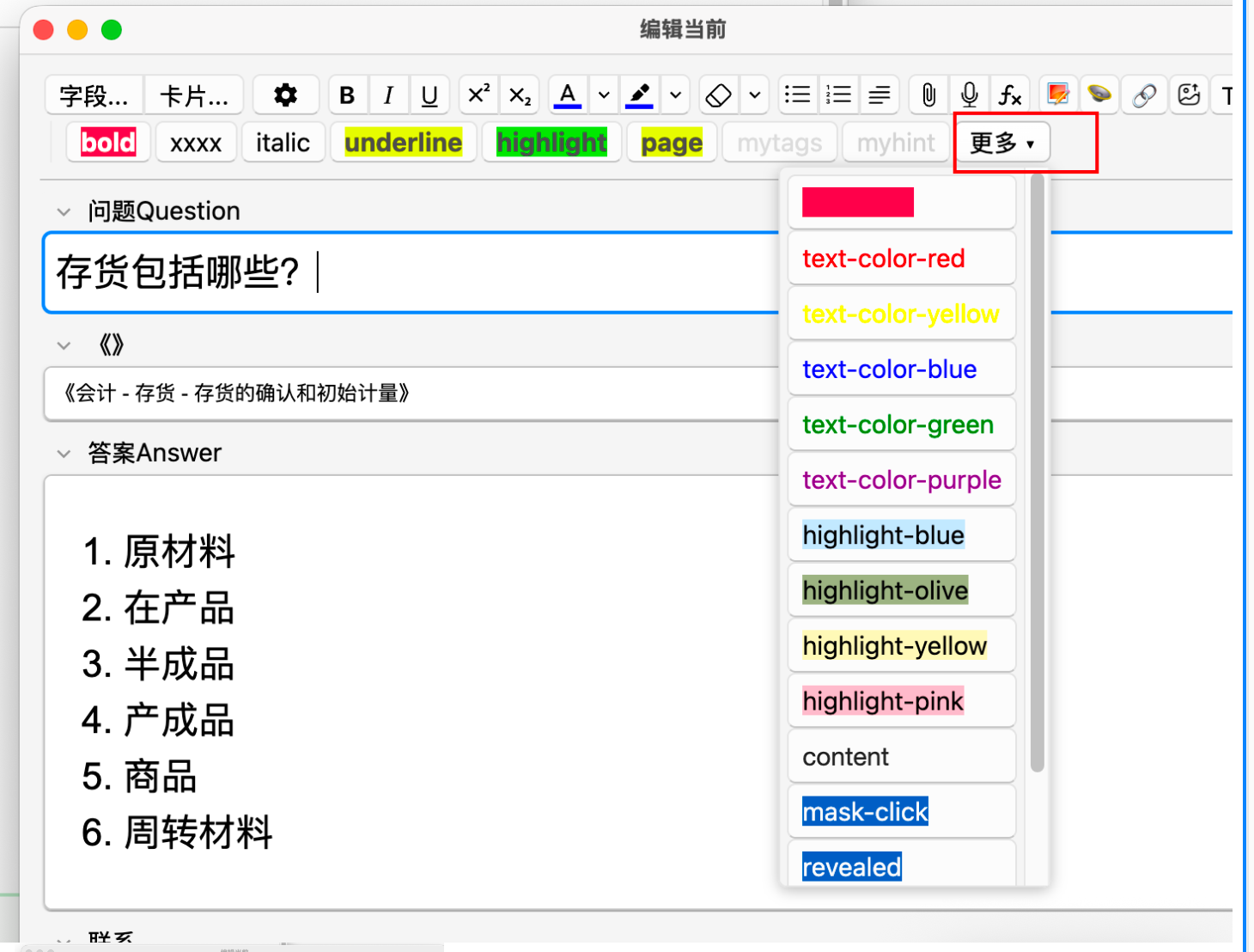
• 按钮数量较多时会自动收进「更多 ▾」下拉菜单,可在工具栏与下拉菜单之间互相拖动
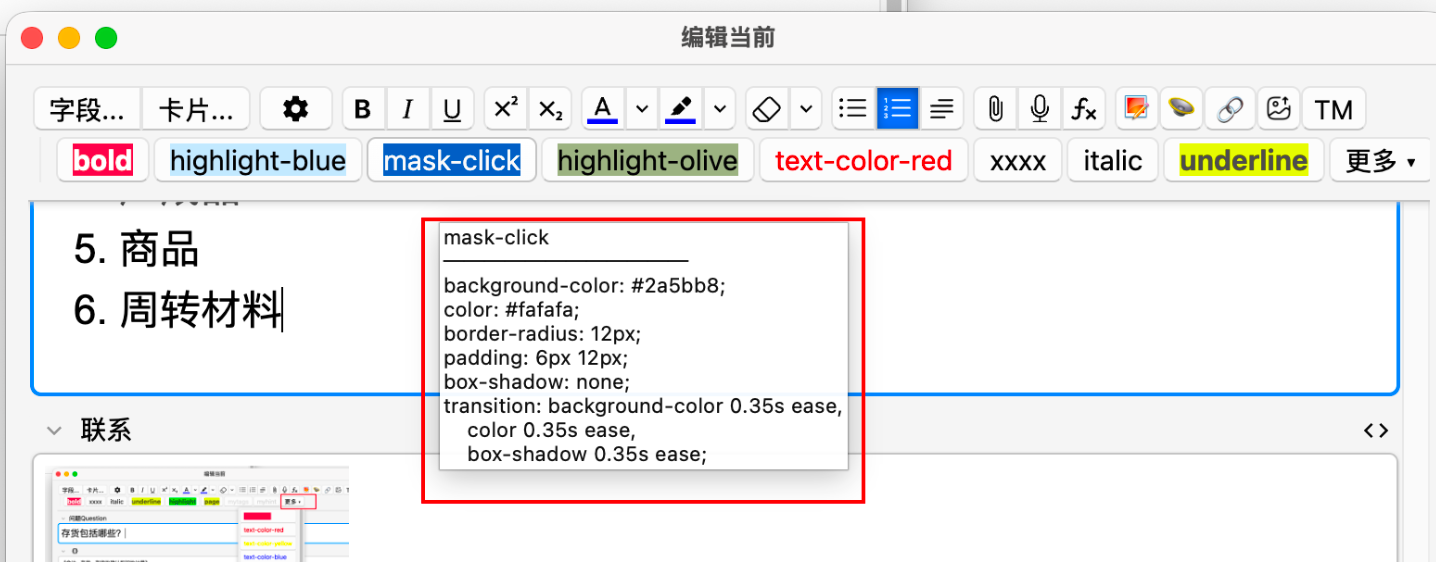
• 按钮显示该 class 的样式预览,悬停可查看 CSS 属性摘要
• 支持自定义显示名称、包裹标签(span / div / mark 等)、快捷键、标记颜色、隐藏不需要的 class
• 支持中英文界面,并跟随 Anki 语言自动切换
━━━━━━━━━━━━━━━━━━━━━━━━━━━━━━
■ 使用方法
- 在某个笔记类型的 Styling 中定义样式,例如:
.bold {
  font-weight: bold;
  background-color: #FF4F58;
  color: white;
  border-radius: 5px;
  padding: 2px 5px;
  margin: 0px 1px;
}

.text-color-red {
  color: red;
}

.highlight-blue {
  background-color: #d0e7ff;
  border-radius: 6px;
  padding: 2px 6px;
  color: inherit;
}

.mask-click {
  background-color: #5577cc;
  color: transparent;
  border-radius: 12px;
  padding: 6px 12px;
  box-shadow: inset 0 0 8px 2px rgba(85,119,204,0.8);
  transition:
    background-color 0.35s ease,
    color 0.35s ease,
    box-shadow 0.35s ease;
  user-select: none;
  position: relative;
}
.mask-click:hover {
  background-color: #789de6;
  box-shadow: inset 0 0 12px 3px rgba(120,157,230,0.9);
}

.mask-click.revealed {
  color: #fafafa;
  background-color: #2a5bb8;
  box-shadow: none;
  user-select: text;
  cursor: text;
}
在卡片样式,正面和背面都添加下面的js函数
<script>
  document.querySelectorAll('.mask-click').forEach(function(elem){
    elem.style.cursor = 'pointer';

    // 切换显示/隐藏的函数
    function toggleReveal() {
      elem.classList.toggle('revealed');
    }

    // 监听点击事件
    elem.addEventListener('click', toggleReveal);

    // 监听触摸事件,解决移动端触控不响应的问题
    elem.addEventListener('touchstart', function(e) {
      toggleReveal();
      // 阻止事件冒泡,避免触发点击两次
      e.preventDefault();
    }, {passive: false});
  });
</script>
- 打开「添加」或「编辑」窗口,工具栏会自动出现
bold、text-color-red、highlight-blue、mask-click 等按钮
- 选中文字 → 点击按钮 → 文字自动包裹为
<span class="vocab">...</span>
- 再次点击同一按钮 → 取消包裹
━━━━━━━━━━━━━━━━━━━━━━━━━━━━━━
■ 配置
打开方式:
• Tools → Style Buttons 设置…
• Tools → Add-ons → 选中本插件 → Config
可设置内容:
• 默认包裹标签(span / div / mark 等)
• 忽略列表(不需要生成按钮的 class)
• 按笔记类型单独配置:显示名称 / 排序 / 包裹标签 / 快捷键 / 标记颜色
• Debug 模式:设为 true 后,样式包裹失败时会在编辑器内弹出诊断提示
━━━━━━━━━━━━━━━━━━━━━━━━━━━━━━
■ 兼容性
• Anki 2.1.55+(Qt6)
• 已在 Anki 24.06 ~ 25.09.4上验证
• 支持 Windows / macOS / Linux
• 支持 添加(Add)/ 编辑(Edit)/ 浏览器(Browser)三种编辑场景
━━━━━━━━━━━━━━━━━━━━━━━━━━━━━━
■ 说明与限制
• 仅解析模板内 Styling 的 CSS,不支持 @import 引入的外部样式
• 仅支持 class 选择器(.class),不支持 ID 选择器(#id)
• macOS 用户如需使用 Command 键作为快捷键,请填写 "Cmd+Shift+X" 这类格式
━━━━━━━━━━━━━━━━━━━━━━━━━━━━━━
■ 反馈与源码
欢迎反馈问题与建议!
GitHub:
https://github.com/scarlett-bai/style_buttons_for_editor
━━━━━━━━━━━━━━━━━━━━━━━━━━━━━━━━━━━━━━━━━━━━━━━━━
ENGLISH
━━━━━━━━━━━━━━━━━━━━━━━━━━━━━━━━━━━━━━━━━━━━━━━━━
Defined nice CSS classes in your card template's Styling, but tired of hand-typing <span class="...">...</span> every time?
This add-on automatically parses the current note type's CSS and turns custom classes into one-click buttons in the editor toolbar:
select text → click → wrapped. No memorizing class names, no typing tags.
━━━━━━━━━━━━━━━━━━━━━━━━━━━━━━
■ Features
• Parses the current note type's CSS and creates a button for each custom class
• Buttons auto-refresh when switching note types; hidden when no custom classes exist
• Click to wrap selected text in <span class="xxx">…</span>; click again to unwrap (toggle)
• Inserts an empty tag and places the caret inside when nothing is selected
• Drag-and-drop to reorder buttons, with order saved automatically
• Overflow buttons collapse into a More ▾ dropdown; drag items between the toolbar and dropdown
• Each button shows a live style preview; hover to view a summary of CSS properties
• Customize display name, wrapping tag (span / div / mark), shortcut, marker color, and hidden classes
• English and Chinese UI, automatically following Anki's language setting
━━━━━━━━━━━━━━━━━━━━━━━━━━━━━━
■ How to Use
- Add styles to a note type's Styling, for example:
.bold {
  font-weight: bold;
  background-color: #FF4F58;
  color: white;
  border-radius: 5px;
  padding: 2px 5px;
  margin: 0px 1px;
}

.text-color-red {
  color: red;
}

.highlight-blue {
  background-color: #d0e7ff;
  border-radius: 6px;
  padding: 2px 6px;
  color: inherit;
}

.mask-click {
  background-color: #5577cc;
  color: transparent;
  border-radius: 12px;
  padding: 6px 12px;
  box-shadow: inset 0 0 8px 2px rgba(85,119,204,0.8);
  transition:
    background-color 0.35s ease,
    color 0.35s ease,
    box-shadow 0.35s ease;
  user-select: none;
  position: relative;
}

.mask-click:hover {
  background-color: #789de6;
  box-shadow: inset 0 0 12px 3px rgba(120,157,230,0.9);
}

.mask-click.revealed {
  color: #fafafa;
  background-color: #2a5bb8;
  box-shadow: none;
  user-select: text;
  cursor: text;
}
Add the following JavaScript function to the card styling, front template, and back template.
<script>
  document.querySelectorAll('.mask-click').forEach(function(elem){
    elem.style.cursor = 'pointer';

    function toggleReveal() {
      elem.classList.toggle('revealed');
    }


    elem.addEventListener('click', toggleReveal);


    elem.addEventListener('touchstart', function(e) {
      toggleReveal();

      e.preventDefault();
    }, {passive: false});
  });
</script>
- Open the Add or Edit window — buttons such as
bold, text-color-red, highlight-blue, and mask-click will appear automatically in the toolbar
- Select text → click a button → the text is wrapped automatically
- Click the same button again → unwrap
━━━━━━━━━━━━━━━━━━━━━━━━━━━━━━
■ Configuration
Open settings via:
• Tools → Style Buttons Settings…
• Tools → Add-ons → Select this add-on → Config
Available options:
• Default wrapping tag (span / div / mark, etc.)
• Ignore list (classes that should not generate buttons)
• Per-note-type settings: display name / order / tag / shortcut / color
• Debug mode: when set to true, diagnostic messages will appear in the editor if wrapping fails
━━━━━━━━━━━━━━━━━━━━━━━━━━━━━━
■ Compatibility
• Anki 2.1.55+ (Qt6)
• Tested on Anki 24.06 ~ 24.11
• Works on Windows / macOS / Linux
• Supports Add / Edit / Browser editing contexts
━━━━━━━━━━━━━━━━━━━━━━━━━━━━━━
■ Notes & Limitations
• Only parses CSS from the template's own Styling; external styles imported via @import are not supported
• Only class selectors (.class) are supported; ID selectors (#id) are not supported
• On macOS, if you want to use the Command key in shortcuts, please use a format like "Cmd+Shift+X"
━━━━━━━━━━━━━━━━━━━━━━━━━━━━━━
■ Feedback & Source
Issues and suggestions are welcome!
GitHub:
https://github.com/scarlett-bai/style_buttons_for_editor